
The Sign of the Whale: Pacific Life's Logo
In early 1999, Pacific Life began working on one of its biggest initiatives in recent memory: a logo to accompany its new name and humpback whale brand identity. The rebranding revolutionized the company’s image. Consumers took notice.
 Pacific Life launched the new corporate logo on June 1, 1999.
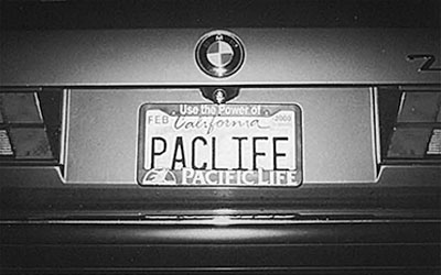
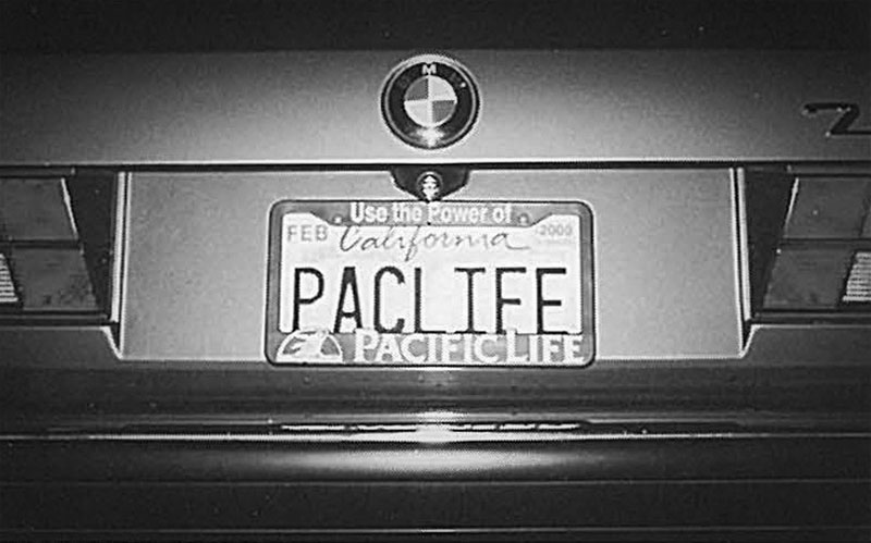 To celebrate the launch of its logo, Pacific Life gave employees license plate frames, coffee mugs, coasters and mousepads that displayed the new look.
 Pacific Life Archives
Long before the new logo was introduced, the company had to settle on a design—and that wasn’t so easy. Focus groups in San Diego and New York failed to tip the scales toward a clear winner. Read about how Pacific Life finally made its decision between the top two choices in this excerpt from an April 30, 1999, memo to the company by Bob Haskell, senior vice president of public affairs:
So we looked for the answer inside, from our employees (at least those who accessed their e-mail on Wednesday). At this point we fully expected the two designs to tie again, leading us to a coin toss. But something unusual happened. After over 1,200 votes were cast, there was an overwhelming consensus (82% in favor) behind the design featuring a breaching humpback whale within a semicircle! And, I understand the response nearly crashed our e-mail system. Fortunately, you selected the design favored by Tom Sutton and Glenn Schafer, which made the conclusion of this process all the easier....
It is important to remember that we have selected a stylized depiction of a breaching humpback whale. The picture is not perfectly accurate; we have avoided barnacles, bumps, scratches, notches, etc. that are common on whales. This particular design of a humpback in mid-breach was really the only way to depict the power and size of a whale on a business card. The gold foiled whale on the cover of our annual report is very nice, but when it is sized to fit a business card, it looks like a minnow. Our testing with consumer groups demonstrated that they easily recognized the logo we have selected and felt it conveyed the attributes we are seeking to align with. As one of our focus group participants said, “You look at this and see both Pacific and Life in the picture itself — it makes sense.”